designer
of designers
...and other assorted experiences, spanning both decades and mediums.
From the c-suite to the classroom, when the world changes — people call me.
Greetings! Chris Courtney here :)
I’m a product designer from Chicago, spending the majority of my adult life operating in the choppy waters of new opportunity. While I carry plenty of scars from both success and failure, I value them equally as a reminder for the challenges ahead.
Taking copious notes along the way, I’ve applied those observations to educating new designers in hopes that my prior mistakes might allow them to make even better ones. Some of the most popular companies in the world employee my students (Apple, Microsoft, Disney, Figma). Even more are creating substantial work at places you’ll never hear of.
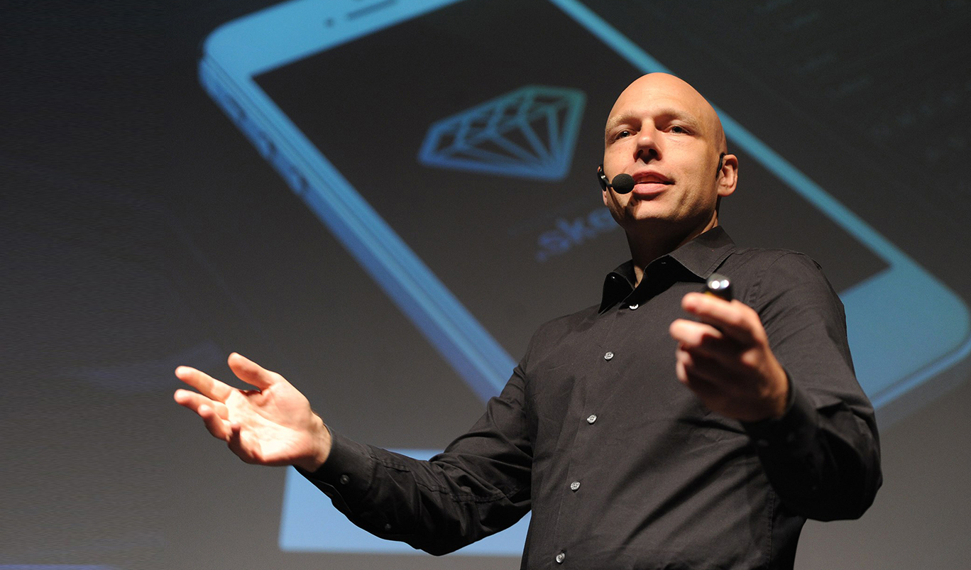
In addition, I’ve been lucky enough to lead design and strategy workshops all over the world.
Oh, and I do a bit of product design. View my recent work here.
Designer. Mentor. Leader.
While I identify as all of the above, I’ll let the people I have had the pleasure of working with tell you who I am and what I can do:
“The impact that Chris had on my life/career is hard to put into words without sounding totally over the top. Thanks to Chris I landed the job ... just a couple weeks after completing the program.”
Sam Hankins
Lead Designer, The Coral Project at Mozilla
“Chris Courtney is exactly what you would expect of a dedicated, supportive and encouraging mentor, and then some. He is an incredibly genuine person; he works with you with your success in mind, pushing you to achieve nothing less than your best.”
Zoë Chinonso Ene
Designer, Microsoft
“Chris is an incredible, natural leader who demonstrates an unmatched work ethic and genuine passion for his work everyday. Not only a talented design leader, Chris is an incredible manager who invests the time needed to coach and develop his team, and provide direct feedback as needed. Chris was an indispensable part of Bloc's senior staff, and I would gladly hire him (or work for him!) in the future..”
Clint Schmidt
CEO, Bloc
“Chris breathes life into software products in a way I have never seen in any other design partner. He is incredibly product-minded in that he thinks end to end from the expected engineering lift, to other impacted features all while keeping UX/UI strategy top of mind. He does this through effective and collaborative partnership with product and other stakeholders, never stepping on toes but making the whole team and product suite better because their paths crossed.”
Gabrielle Castaldo
Product Manager, Shift.org